
 Data Quality Visualizer
This visualizer provides a comprehensive assessment of data quality for each field.
Interface
Toolbar
When you enter the visualizer, its toolbar provides the following tabs and buttons:
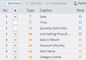
 Summary: This tab provides the dataset overview. When you first enter the visualizer, it will display the fields available for processing. After selecting them and calculating the necessary statistics, data quality indicators and detected problems will be shown here.
 Discrete: Click this button to review the data quality indicators calculated for discrete fields.
 Continuous: Click this button to obtain a data quality overview for continuous fields.
 Parameters: Click this to open a window for the selection and configuration of data quality indicators:
 Selection of indicators: Select the metrics for data quality assessment.
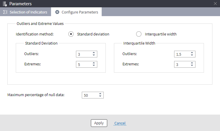
 Configure parameters: This is a tab for setting up outlier and extreme values detection methods. Here you can select one of two methods, change their settings, and set the maximum percentage of missing (null) values.
 Absolute or relative values: This button switches between absolute and percent representation of quantitative values.
 Export: Use this button to export a data quality report. Please note that only the current screen (e.g., Summary, Discrete, Continuous, etc.) will be exported. This command has a dropdown for choosing one of two available export formats:
- Export to XLS (html)
- Export to HTML The name of the format you select appears on the button.
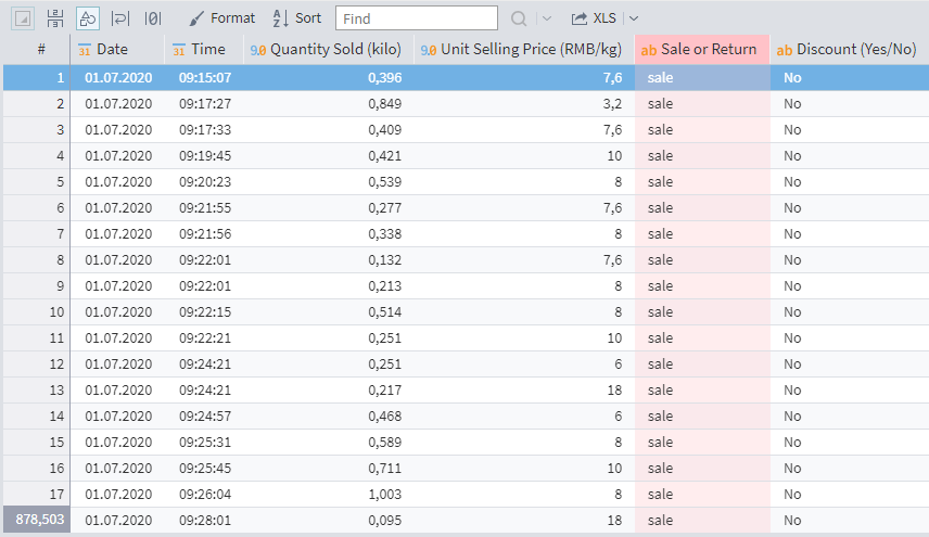
 Detailing: This command (found on the left of the toolbar) is only available for the Discrete and Continuous tabs. It shows the input dataset filtered by the specified metric for the selected field. For example, selecting a Nulls cell will show all records from the input set that have missing values in the selected field.
 Histogram: The histogram is only available for the Discrete and Continuous tabs. The button opens a pane on the left with a histogram for the selected field.
Dataset statistics
Displayed on the right-side of the Summary tab. This pane can be hidden by clicking the ![]() Show/Hide icon on its left. To open it, click the icon again (it will be on the right side of the main window). The pane displays the following characteristics:
Show/Hide icon on its left. To open it, click the icon again (it will be on the right side of the main window). The pane displays the following characteristics:
- Determination of outliers and extreme values: Shows the identification method set in Configure parameters; the default method is Standard deviation.
- Columns: The total number of columns in the dataset.
- Rows: The total number of records in the dataset.
- Fully filled fields: The percentage of fields that do not contain missing values.
- Fully filled records: The percentage of records that do not contain missing values.
- Suitable columns: The number of suitable columns. A column is considered unsuitable if:
- the percentage of missing values is higher than the Maximum percentage of null data (as set in Configure parameters)
- the Quality indicator (included in the Selection of indicators) of a discrete field is 0 (the field contains a constant)
- EPV index: The ratio of the number of records to the number of columns.
Configuration
On opening the Data Quality visualizer, you will see the Summary tab listing all the dataset fields. Select the fields you need for processing by marking/unmarking their checkboxes. (By default, all fields are marked.) Note that the Discrete and Continuous tabs are initially disabled.
Available quality metrics:
Go to the Parameters tab to select the necessary metrics:
| Metric | Data Type | Description |
|---|---|---|
| Quality indicator | Reflects the diversity of values in the field | |
| Histogram | Histogram preview | |
| Extremes | The number of records containing extreme values | |
| Empty | The number of records with empty values | |
| Trailing spaces | The number of records with values that end with a whitespace (this metric does not include records consisting only of whitespace characters) | |
| Range of values | The value range in the format: first value...last value (for a sorted list of values) |
|
| Zeros | The number of records where values are zero | |
| Box plot | Calculates the metrics: Minimum outlier, Lower quartile, Median, Upper quartile, Maximum outlier, Sample maximum | |
| Minimum | Minimum value | |
| Mean | Mean value | |
| Mode | The most frequently occurring value1 | |
| Nulls | The number of records in which a value for the field is missing | |
| Values | Displays a chart showing the diversity of values across rows | |
| Outliers | The number of records in which the value is an outlier | |
| Whitespaces | The number of records with values consisting only of whitespace characters | |
| String lengths | The range of string lengths in the format: minimum length – maximum length | |
| Negative | The number of records with negative values | |
| Infinities | The number of records where values are equal to infinity | |
| Unique | The number of unique values | |
| Maximum | Maximum value | |
| Median | The median for the field | |
| Monotony | Shows the uniformity of field values (Decreasing, Increasing, or Non-monotonic) |
1. If there are multiple mode values in the field, the first of these values is shown, and themultimodality icon is displayed. ↩
Configuring specific indicators
After selecting the necessary indicators, go to the Configure parameters tab of the Parameters window to set up the identification method for outliers and extreme values and the maximum percentage of null values.
Calculating and reviewing statistics
After selecting the fields and metrics for data quality analysis, click the ![]() Calculate statistics button.
Calculate statistics button.
Now the Discrete and Continuous tabs become available, displaying all the calculated indicators for discrete and continuous fields, respectively.
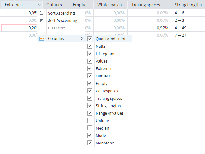
Next to each indicator, you will find the ![]() Options button. The options it provides are sorting fields by the selected metric and removing some calculated indicators from the table (or adding them again).
Options button. The options it provides are sorting fields by the selected metric and removing some calculated indicators from the table (or adding them again).
When you select a cell and click the ![]() Detailing button (on the right), an additional pane opens at the bottom, highlighting all the records from that cell.
Detailing button (on the right), an additional pane opens at the bottom, highlighting all the records from that cell.
When you select a cell and click the ![]() Histogram button (on the right), a pane with a detailed histogram opens on the right side of the main window. For discrete fields, you can configure the histogram to show only specific values:
Histogram button (on the right), a pane with a detailed histogram opens on the right side of the main window. For discrete fields, you can configure the histogram to show only specific values:
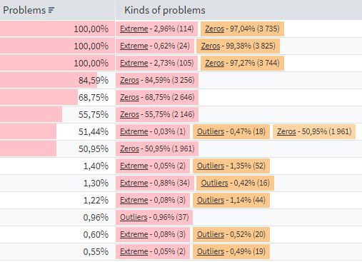
Detected problems
On the Summary tab, the Problems column displays the total count of problematic rows for the given field.
The Kinds of problems column provides some details:
- Nulls: The number of records containing missing values.
- Empty: The number of records containing empty values.
- Zeros: The number of records containing zero values.
- Whitespaces: The number of records containing only whitespace characters (space, non-breaking space, tab, etc.).
- Infinities: The number of records containing the value
infinity. - Constant: Indicates that the field contains only one unique value, although there may be missing values in the field.
- Unique: Indicates that every value in this field is unique.
- Conversion error: Appears if the field contains values that cannot be converted to the field's data type.
- Not calculated: Marks fields that do not contain calculated metrics.
- No data: Appears when attempting to analyze an empty dataset.
- Extremes: The number of records in which the value is extreme.
- Outliers: The number of records in which the value is an outlier.
- Negative: The number of records with negative values.
- Trailing spaces: The number of records with values that end with a whitespace character (this metric does not include records consisting only of whitespace characters).
Next to each kind of problem in the column, you will find the assessment of rows containing that problem: as a percentage to the total number of rows and as a quantity (in parentheses).
Read on: Cube Visualizer